DRS Setup Designs

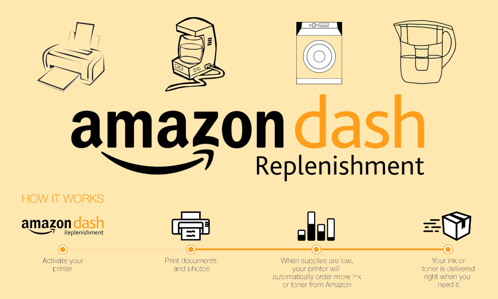
Creating a setup user interface to register an Amazon Dash Replenishment Service (DRS) device

Problem: Customer had no way to register a DRS device after purchasing it. They didn't have a way to select items that they wanted their DRS devices to purchase or a way to send it to a particular location. They didn't have a way to order products or cancel the ability of the reordering feature.

Goals: Give customers a pain-free, one time experience that they can go through to completely and full register their device.

Solution: Create a setup experience that allows the customer to set all the features that are essential to the device functioning properly. Also create a settings page that the customer can come back to and change any of the properties that they first set.

My roles: Interface design, user research/testing, multi-platform support, software development, systems design

Tools: Photoshop, HTML, CSS, Javascript, Java

Project duration: ~6 months

Features:

  • Allow customers to register device through Amazon
  • Allow customers to select various different product for their device
  • Allow customers to select order payment/shiping information
  • Allow customers to stop reordering products/reenable ordering products
  • Allow customers to go back and change any of these settings at a later point in time
  • Initial design & Improvements

    For this project we already had a main UX lead, so I mainly focused on development work. I show some of the preliminary designs I received below. (P.S. Sorry for some of the blurry images - they are all I have since I don't have the originals).

    No Image Loaded

    However through the process of looking through the initial designs and actually implementing them, I came upon many subtleties not expressed in the original design. When I felt that these problems created a subpar user experience, I would redesign several alternatives and test them with my team. I would then present them to our main UX lead and collaborate with him to find a mutual solution. I'd like to talk about some of the significant changes below.

    Canceling items

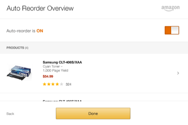
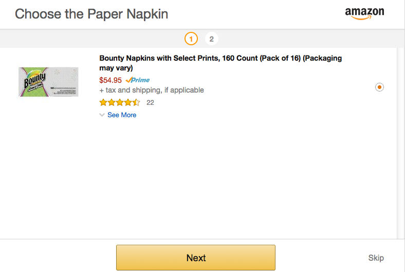
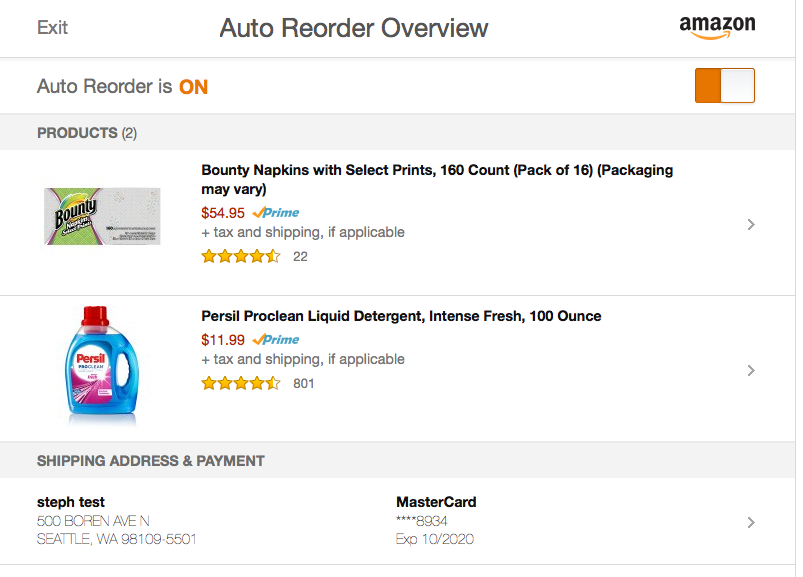
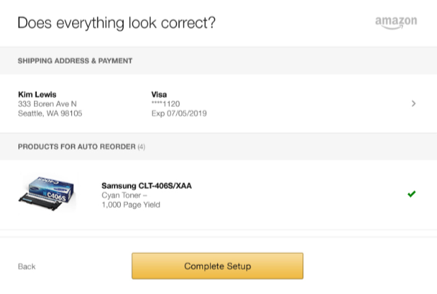
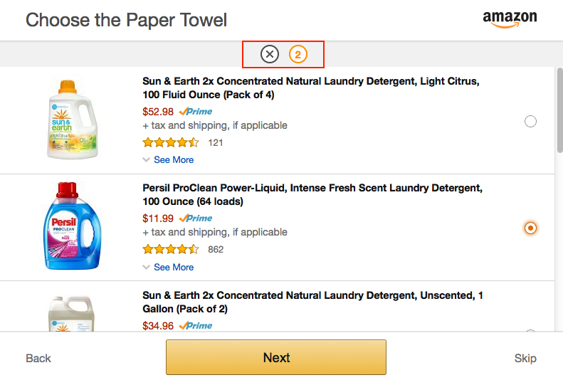
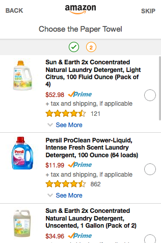
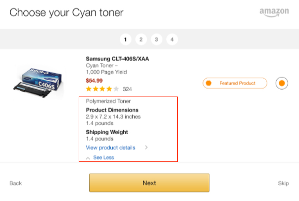
    Use case: When a user selects an item, it means that user wants the DRS device to reorder that item when the device runs low on said item. After selecting an item at setup, users are allowed to change that item later through a settings page. The following is an initial design for allowing the user to "stop selecting" a certain item.

    I saw several things I thought made for a bad user experience.
  • Allowing "stop autoreorder" as a radio button in and of itself was highly confusing. What would the user do, select that option and then hit the "select" button?
  • What would happen after the user hit "select"? Would it redirect to the settings page?
  • The wording was extremely confusing. It was unclear what "stop autoreorder" really meant. Did it mean, I don't want this particular item to be reordered anymore, but I still want it to be selected. Or did it mean "I no longer want this item to appear in any capacity on my settings page."
  • If the user thought that "stop autoreorder" meant stop it for that particular item, how would we should the user that only that item and not another item was not being reordered? Would this require another element in the settings page to display this? What would it then mean to have the global "auto reorder" toggle on or off?
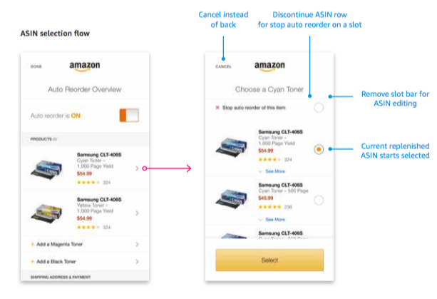
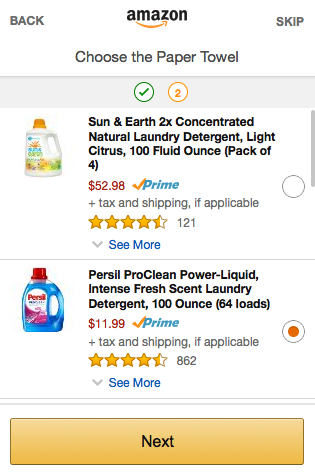
  • Alternative: I proposed that instead of having this as a radio button, we put something in line with the element itself (such as a small 'x', or a 'cancel' bar) that would simply deselect the radio button immediately. This provided many benefits:

  • Allowed user to see exactly what action clicking the button did, without having any sort of magical redirects
  • Removed the confusion around whether this item would be "auto reordered" or not, because once it was deselected it was clear that the item was no longer tied with the device
  • Did not confuse the item element with any other UI on the screen - aka the radio button still only served 1 single purpose: to select an item
  • No Image Loaded

    Non selected items

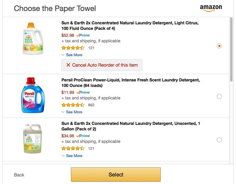
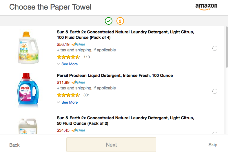
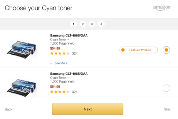
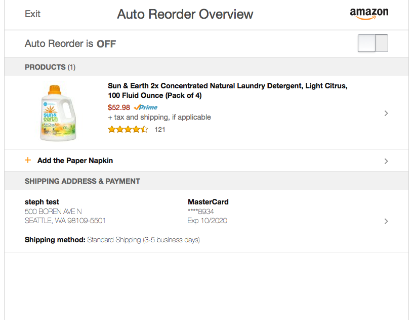
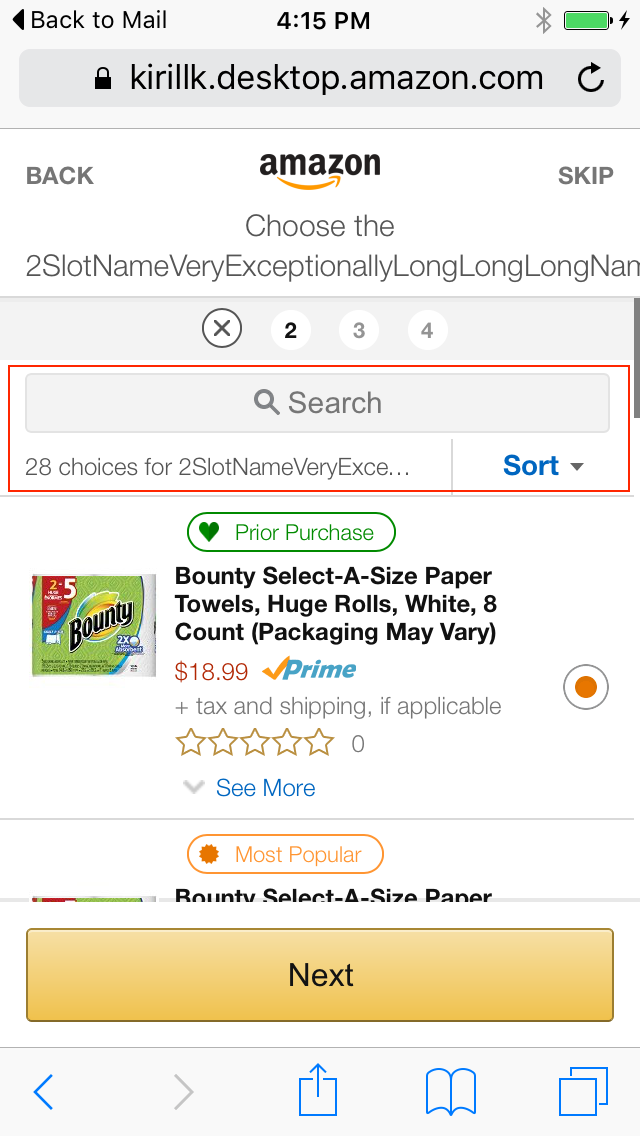
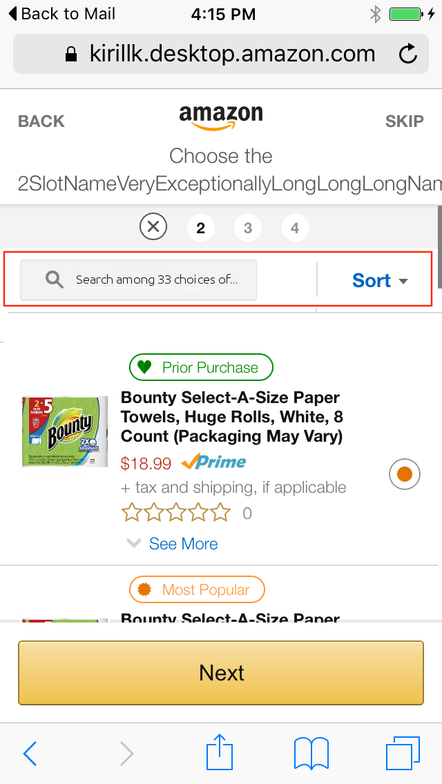
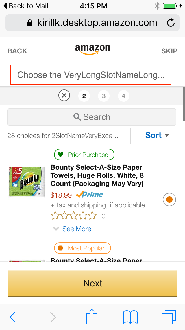
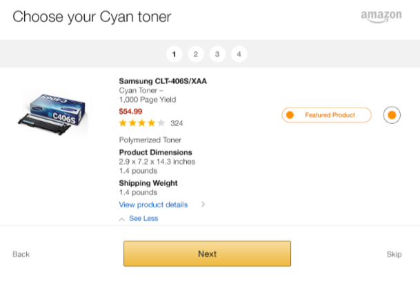
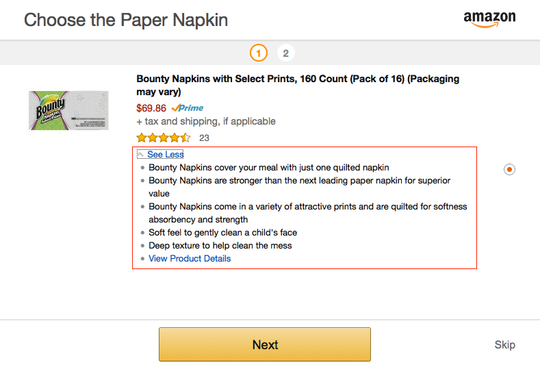
    Use case: The user can select multiple items for each device. For example in the case of a printer, the user can select Black, Magenta, and Cyan inks. The user can also choose not to select items for these categories if they do not want to order a specific color (ex: they only want to print black and white photos). The initial designs (below) did not clearly display this case to the user. When the user did not select any items for a particular category, that category simply did not appear in the summary or settings page. If the user accidentally skipped a slot, it was difficult to be reminded of how to navigate to a screen that would allow them to select the item.

    Alternative: I proposed an add-on to the design that would include each category that the user had NOT selected as an "emtpy slot". This provided many benefits:

  • The "empty slot" followed the same paradigm as the "full slot" so it did not disrupt the UI.
  • The empty slot was clearly marked with a "+" to indicate it was empty and the user needed to add an item.
  • The empty slot was clearly marked with the words "SKIPPED" to indicate it had been skipped during the setup process.
  • The user could easily navigate to the desired area to fix the problem with a single tap, with a widely known chevron (>) as the affordance
  • No Image Loaded

    Skipping an item

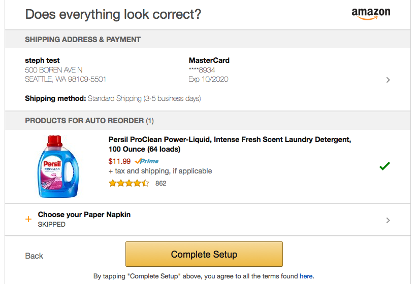
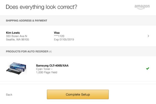
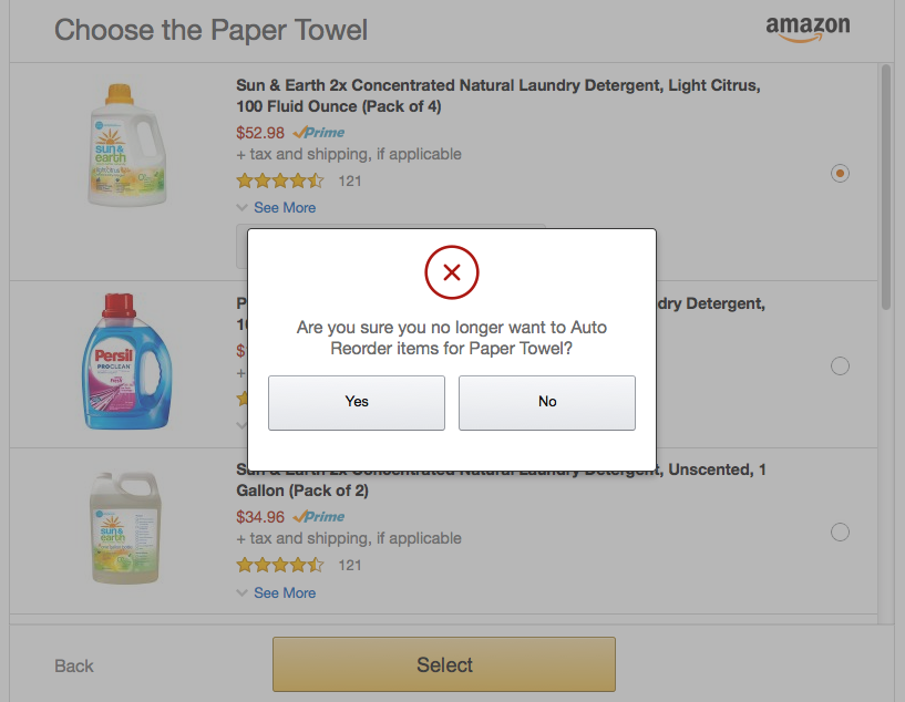
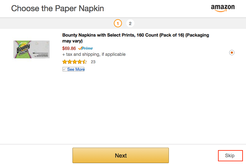
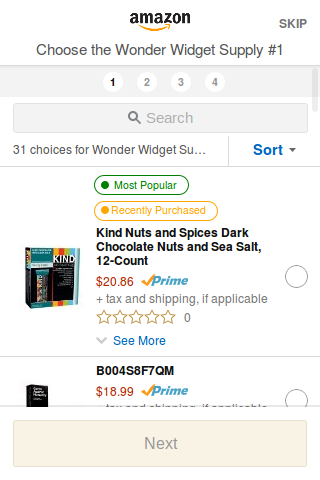
    Use case: The user has an option to skip a category during setup. Initial designs also used this "skip" to clear a selection if the selection was already present. For example, if the user selected an item, then went back to that item at a later time in the setup process, then clicked "skip", it would act as if the user never selected that product.

    No Image Loaded

    To me this seemed confusing:

  • Gives "skip" two meanings: What if the user was simply double checking the item details, then wanted to "skip" aka move on to the next slot?
  • The only indication to the user that skip does two functionalities was in the top navigation bar and the summary page. Both of these were easily dismissable and thus didn't seem like good catch cases for the customer to realize what was happening.
  • If the customer intentionally wanted to remove a product, they would have to navigate to the product itself, press "skip" (a somewhat hidden link), then navigate back through all the other menus.
  • Alternative: I proposed that instead of this we simply kept the paradigm of what was shown in the settings page. The user would see a "cancel reorder" or similar element that would allow them to deselect that item. The pros were:

  • Keeps paradigm of existing design, less for the user to learn
  • Keeps "skip" to 1 functionality
  • Allows users to easily remove items if that is their intention
  • Unfortunately, due to some outside requirements, my design was eventually not implemented. However through testing this with multiple people, I have often seen them get confused by this "skip" feature, and feel that my intended design was a good alternative.

    Mobile space concerns & UI tweaks

    Use case: The smallest popular phone in the market is an old iPhone with rough screen dimension of 330 x 550. This is an extremely small space to work with, and with the addition of various features to the setup UI, it quickly became crowded. I collaborated with our UX lead to come up with multiple ideas on how to save screen real estate. Although space wasn't as much of a concern on desktop, I also made some additional tweaks to improve experience and look.

    No Image Loaded

    Mobile space improvements:

  • Do not allow product name to extend beyond 1 line (use ellipses)
  • Combine text for "33 products found" inside the search bar, instead of on another line
  • Remove the navigation bar if there is only 1 category of item
  • Do not show the 'next' button if no item is selected
  • Fold search bar under when user scrolls up (not implemented due to time constraints)
  • No Image Loaded

    Desktop improvements:

  • Move "featured" and "most popular" labels to the top of the element, not the side (reduce whitespace)
  • Create the "see more" layout as a simple bullet list
  • Put 'View products' as a bullet into this list, instead of its own separate column
  • Various padding/spacing readjustments
  • Final designs

    These were the final designs.

    No Image Loaded